Photography Guidelines
At the heart of S&T’s communications strategy is an invitation to viewers to look to the future, see and think differently, and challenge what is with what could be. To achieve this we use our own unique photography that excites and inspires. The photography’s tone is imaginative, captivating, optimistic, focused, passionate, inspiring and heroic. The photography should capture the drive of discovery and innovation, and the curiosity and exploration of S&T’s forward-thinking students and faculty who are solving for tomorrow.
Color
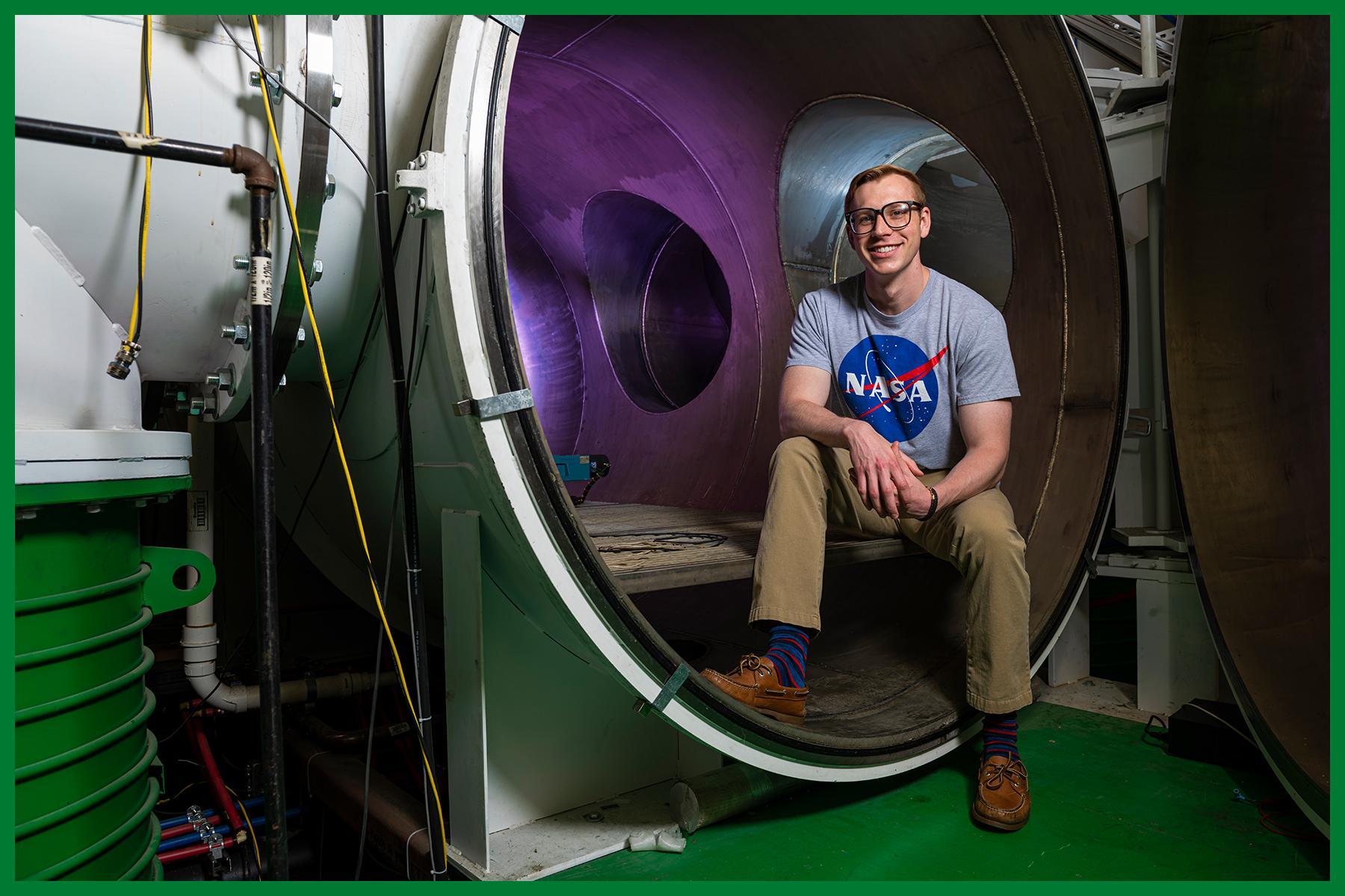
✅ Use full color images to emphasize the bright future of S&T.
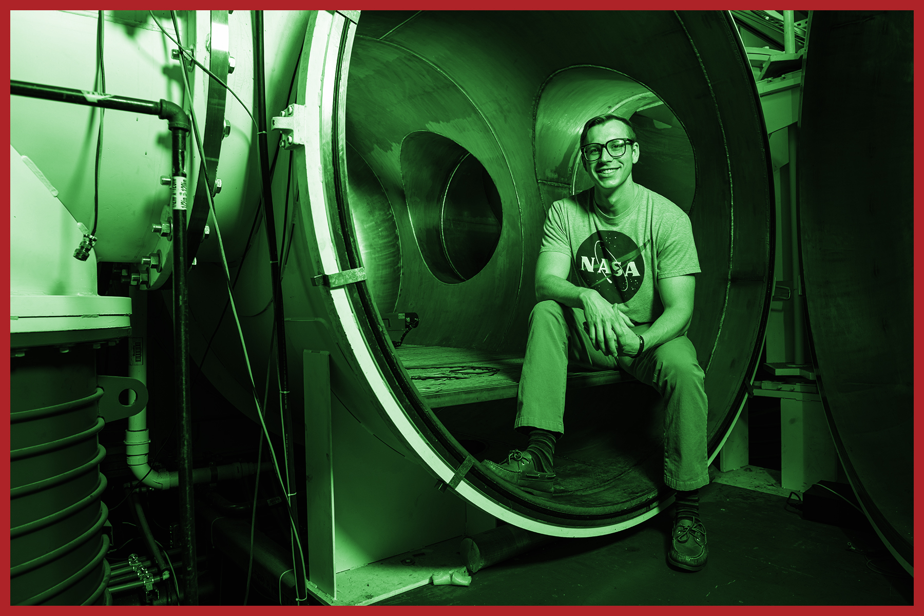 ❌ Duotone and Black and White images should only be used in historical context or where the project is limited to black and white.
Campus Architecture
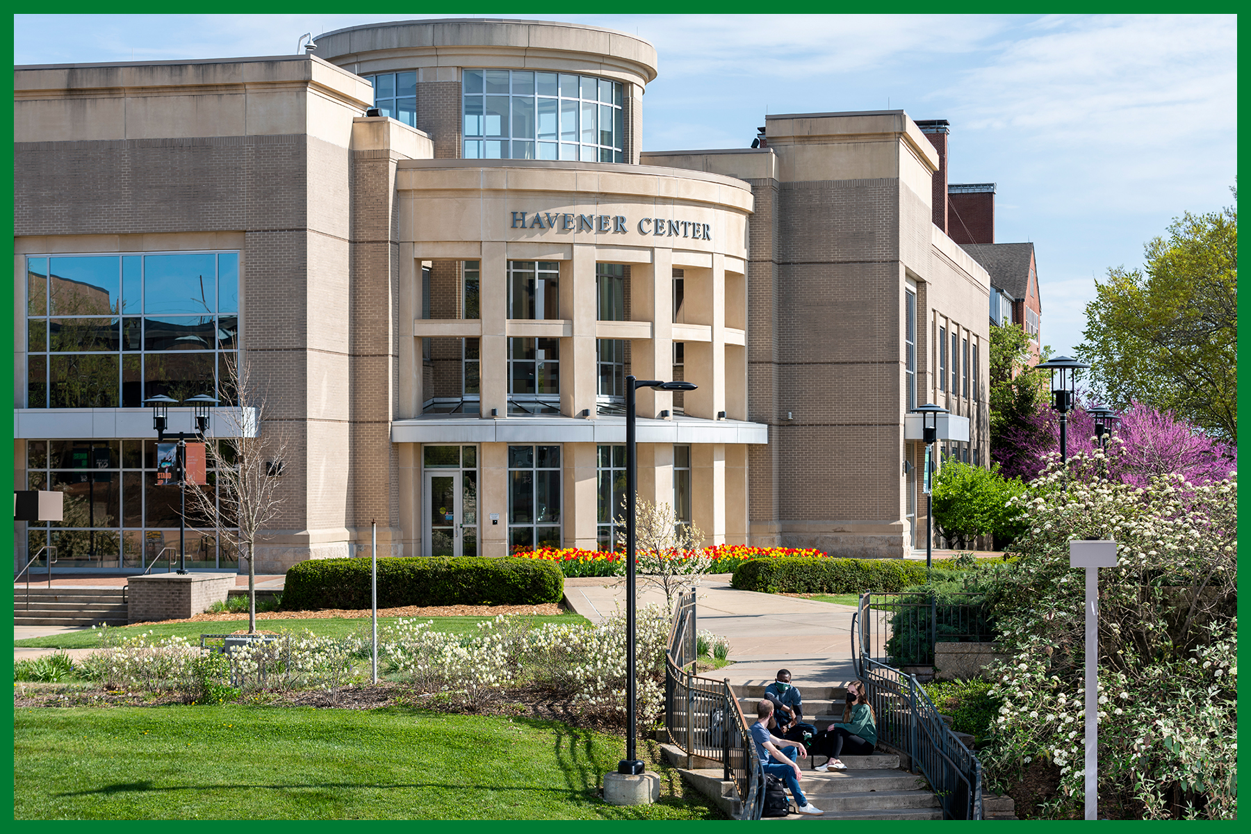 ✅ Include students engaging with others. Emphasize modern buildings, interesting angles, vibrant landscaping and groups of people engaged in activities if possible.
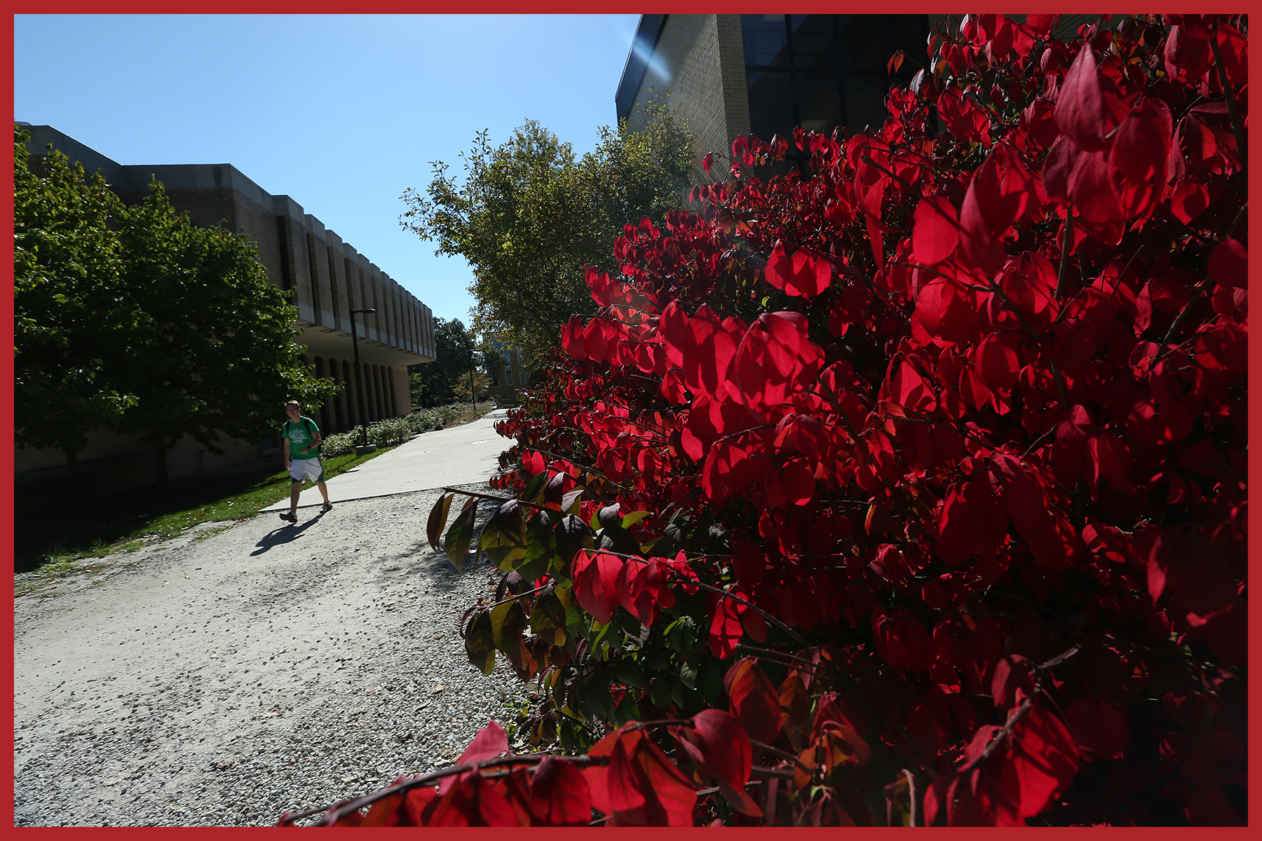 ❌ Avoid strange angles, photos that aren’t level, images that only include the building and ones that include distracting elements like trash cans, vents, vehicles, or lone students/faculty/staff.
Campus Life
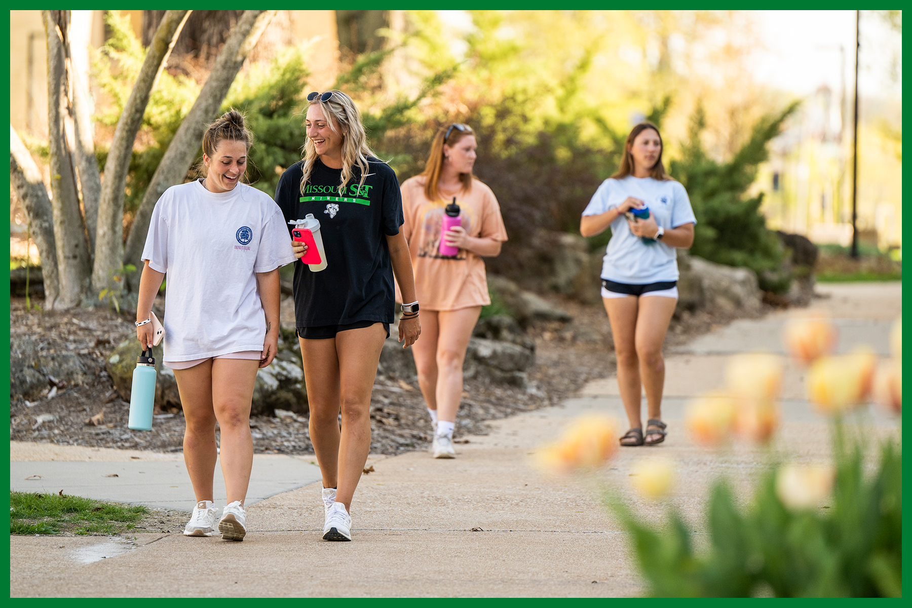 ✅ Students, faculty and staff in engaging moments with open body language and expressing positive emotions.
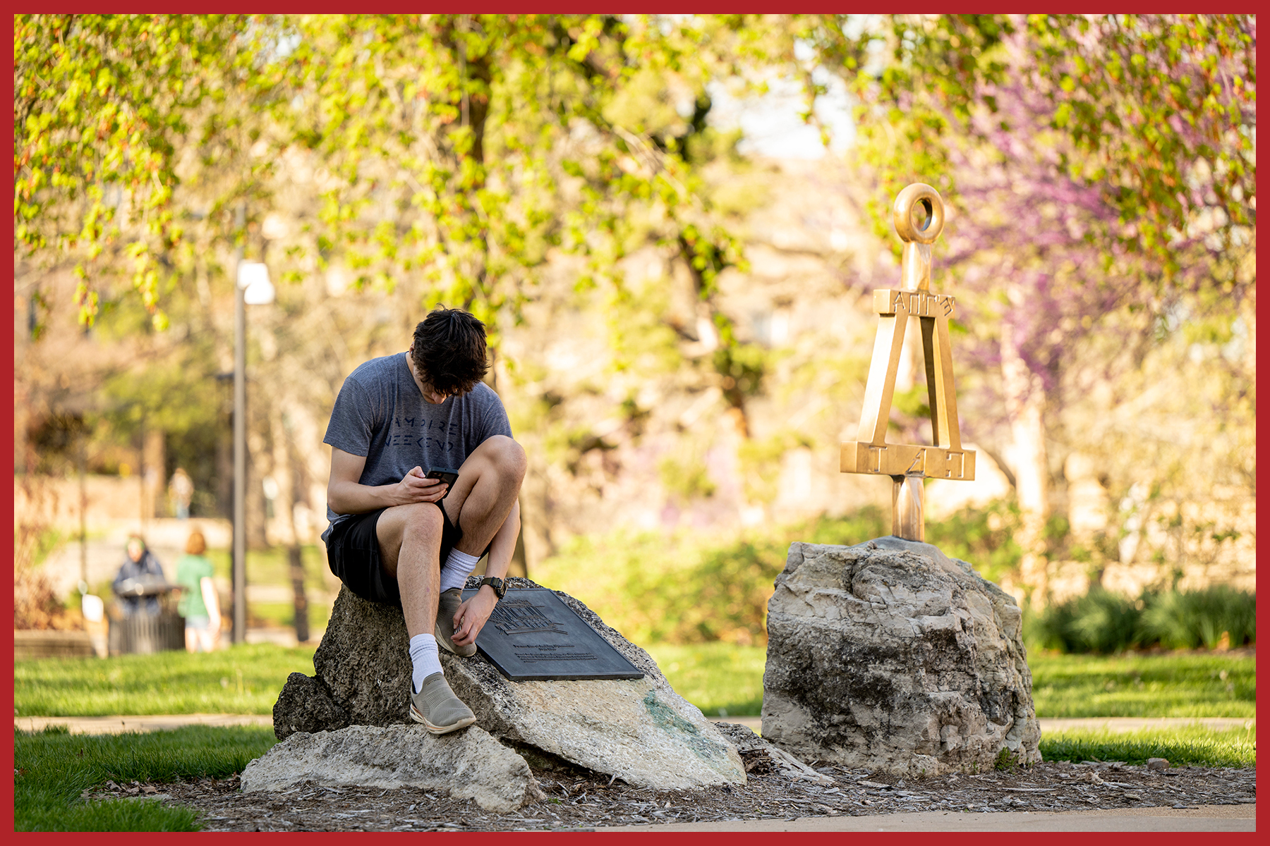 ❌ Avoid students looking bored, only engaged in devices, or photos that appear staged.
Socialization and Friends
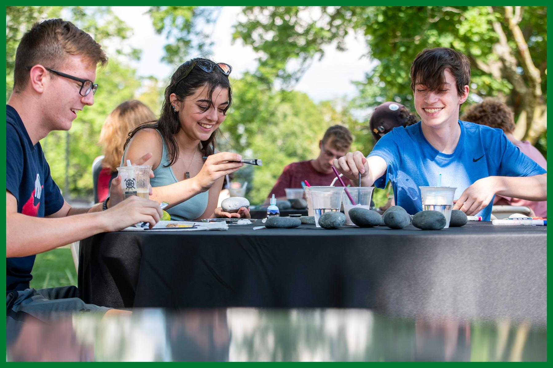 ✅ Images should be of natural, genuine and authentic moments. Expressions should be positive with people interacting.
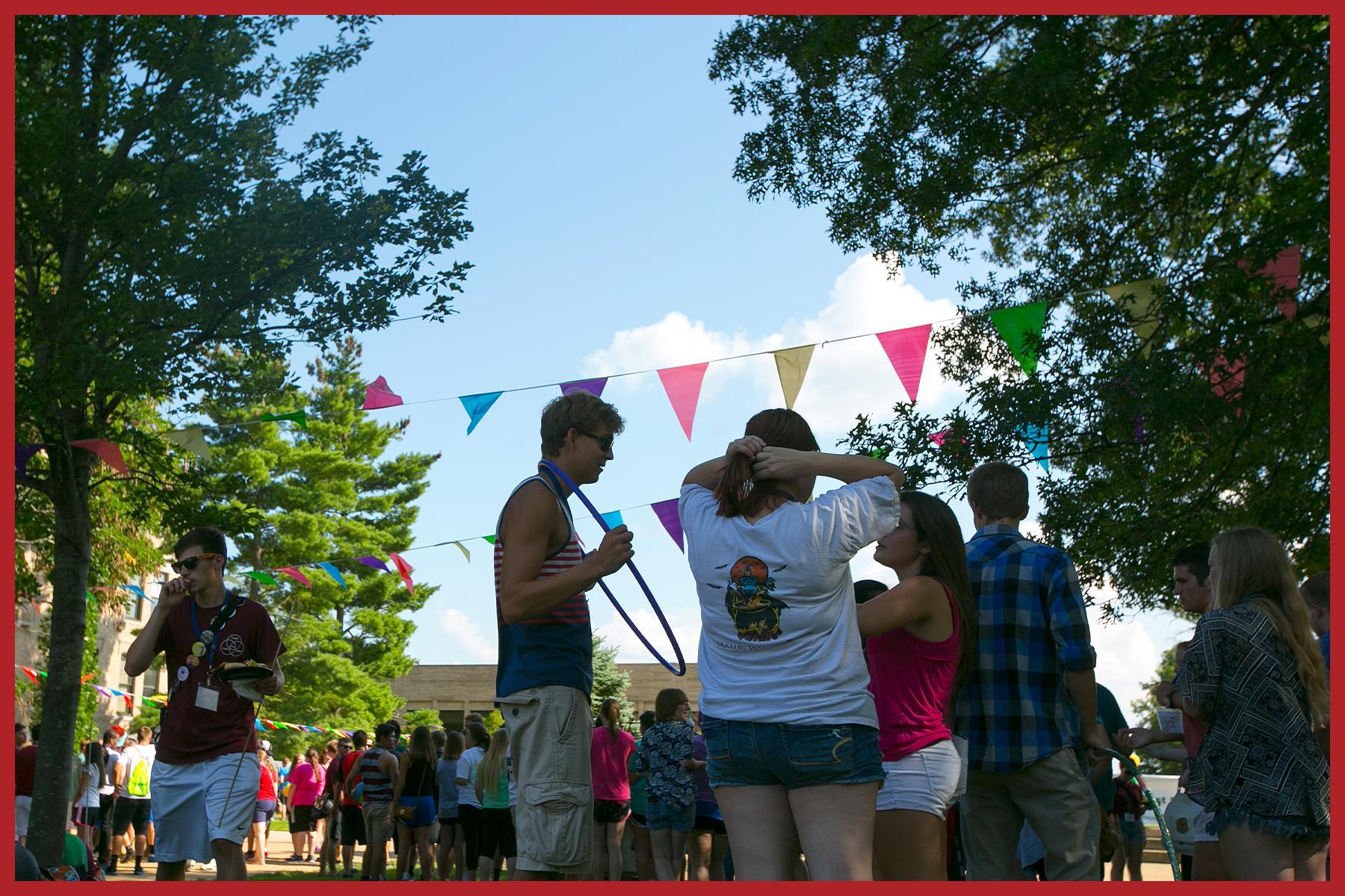 ❌ Avoid photos where students are staged, those that show students that aren’t engaged and backs of people.
School Pride and Culture
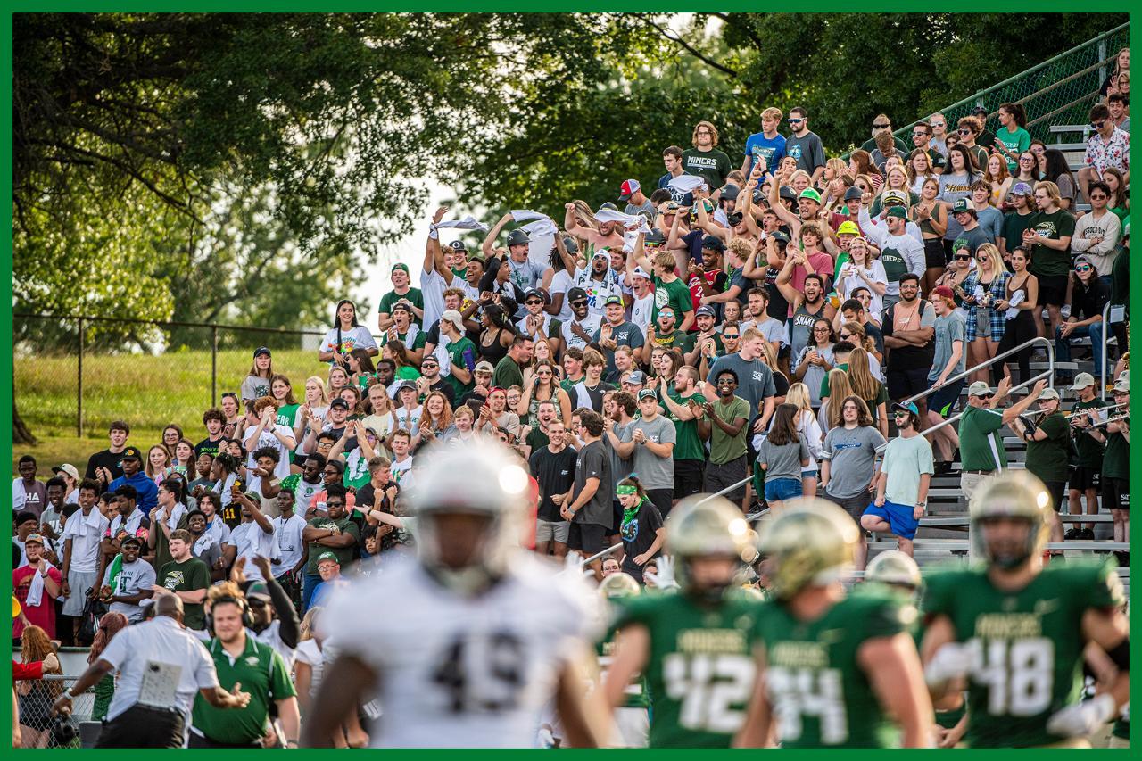 ✅ Large groups of students that help future students picture themselves as part of something bigger and with friends. The school and athletic logos are a plus, as are Joe Miner along with the school/brand colors: silver, gold and green. Current students and alumni with Joe Miner are great.
 ❌ Avoid students participating in activities not allowed on campus, bare or painted chests, purposely visible undergarments.
Commencement
 ✅ Emphasize the achievements of the students, their celebrations and the diversity of the class. Look for moments that reinforce the strong STEM culture and direction of S&T.
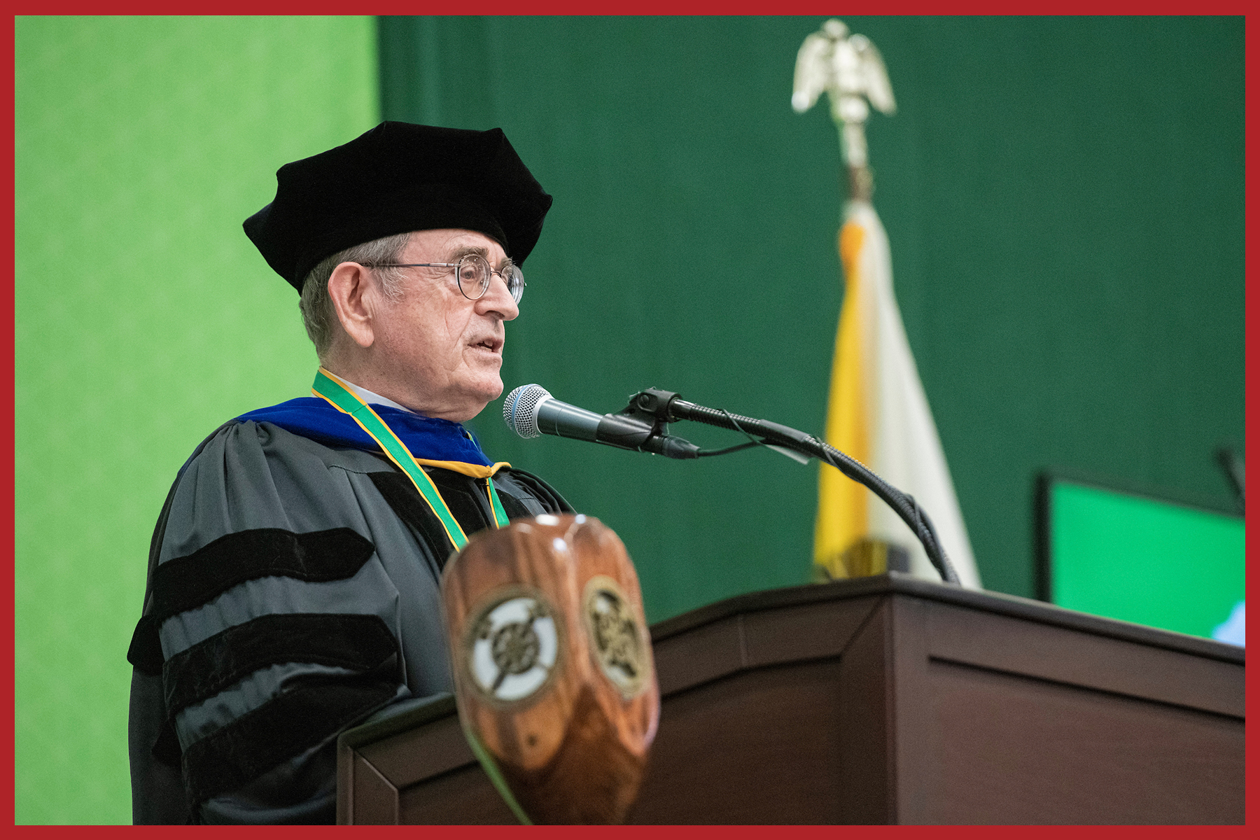 ❌ Avoid using images of faculty, administrators or speakers unless the communication is directly related to the subject.
Research, Innovation and Academics
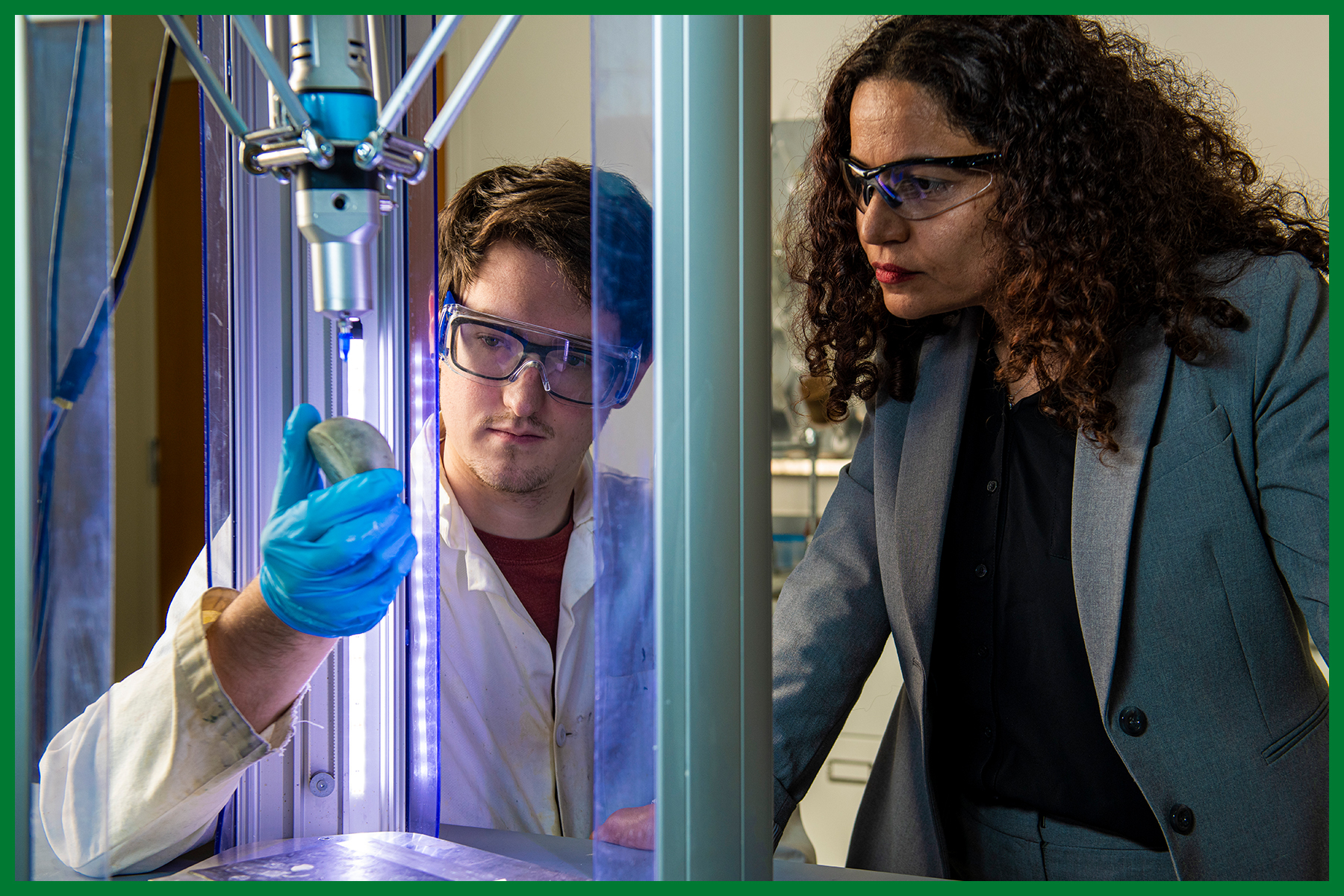 ✅ Photos that show those at S&T solving for tomorrow, focused on innovation, collaboration and students taking the initiative and lead in hands-on work. Photos should be taken in clean, clutter-free lab/research spaces with all subjects using clean and proper PPE for the activity.
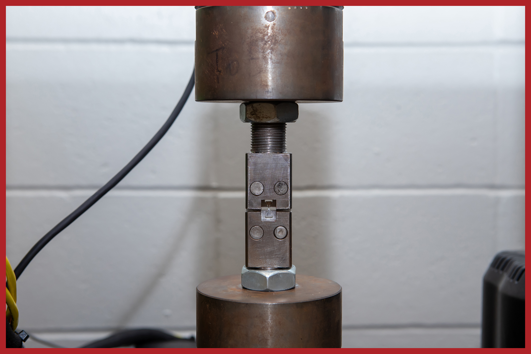 ❌ For the primary photo used in print or online, avoid photos that only show equipment of that the viewer can't connect to.
Portraits
 ✅ Portraits should be taken on location (environmental) or be conceptual/creative (studio). The lighting and composition should be dynamic, dramatic and cinematic with special attention to detail.
 ❌ Avoid using studio headshots for anything other than websites or email unless other options are unavailable or a special series has been planned.
