Choosing a Header
For your site's header, you have two options to choose from: A small, text-only header that allows your content to begin sooner and a larger, decorative header for images that complement your content. These headers cover a broad range of use cases for all departments and offices, providing uniform data where users expect to see it on our distributed subdomain presence. In rare cases, a home page may receive a custom header when it serves as a major audience gateway and handles significantly higher traffic than comparable department and office sites.
Headers are set in your site's "site_info" section, accessible by clicking the TERMINALFOUR logo in the upper left-hand corner of your editing screen. Navigate to "site_info," click the "Content" tab, select "Modify" in the yellow drop-down menu next to the one piece of content, and fill out your department's information. To switch to the decorative header, select three images in the last three fields. The decorative header will activate once these fields are filled on your site's next publish cycle.
Text-only
The default, text-only header is appropriate for all functional and informational sites, and is found on the majority of university subdomains. It provides a menu structure, the name of your department (linked to your homepage), a physical location linked to a Google Maps view, and contact methods including at least email and phone. This information is presented in a consistent format with adequate space for longer department names. This header type is particularly appropriate for internal units where ease of access to information is of higher importance than bold visuals.

Examples of sites with appropriate use of a text-only header:
Chemical Engineering
Computer Science
Biological Sciences
Decorative Header
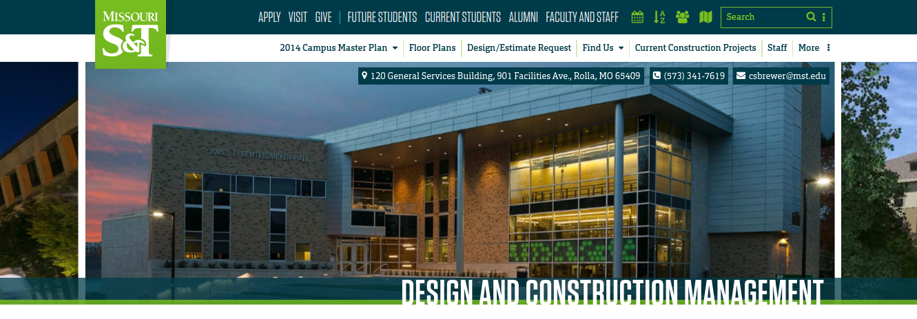
The optional decorative header consists of a slideshow containing three photos and adds unique visuals to sites that are more focused on external audiences. The decorative header is a good way to differentiate your site and to show high quality, visually pleasing representations of the services your department or office provides. A food service site, for example, may wish to show photos of well-prepared food and dining areas; a recreation and fitness center site may wish to show professionally-shot scenes from within the facility.
Site menu, name, physical location, and contact information are presented in similar locations to the text-only menu so that this information is readily available to users.

Using the decorative header requires certain design, quality and technical considerations for the photos, as it can very easily be underutilized or misused. Please keep the following points in mind when deciding to use the decorative header:
- Photos should be high quality
Any photos appearing in the header should be representative of the very best your department or office can present. These photos should ideally be shot by a professional; however, you may provide your own. These photos should never be "cell phone quality." - Photos should load quickly
While the screen size of the viewing device will affect the scaling of the photo, the image's actual dimensions should be 1280x500 pixels. Following photo size and slide limits ensures that photo quality will remain high while not requiring an unreasonable amount of download time or data usage. - Photos should contain no text
While some exceptions may be made here such as signage, papers, computer screens or labels that are not the focus of the shot, photos should generally remain free of text. Text in images cannot be translated by browser plugins, and no alt text will be available for these decorative shots on screen readers. - Photos should not be "busy"
Visually busy photos draw the eye away from your content and back to your header, especially when slides change. This can turn your header from a pleasant decoration into a nuisance that causes readers to lose their place in your content. Avoid visually complicated shots featuring large groups of people, many focal points, or excessive background activity. - Photos are to remain decorative
This header is a decorative element of your site, not a functional component. It is not for promoting department activities, announcing news, assisting in site navigation, or any other activity that would construe it as content as opposed to visual flavor. - Photos should be complementary
Not all great photos work together. When selecting photos, consider how they look as a group. Does one look out of place? Do the subjects of the photos work together to make it feel like a unified series?
A decorative header may not be necessary or appropriate for your site. It is purely an optional addition that was not available in previous templates. Photography assistance is available if you would like help choosing appropriate photos.
Examples of sites with appropriate use of a decorative header:
Design and Construction Management
Marketing and Communications
Custom Header
In rare cases, a home page may receive a custom header when it serves as a major audience gateway and handles significantly higher traffic than comparable department and office sites. These sites generally handle 10,000 or more visitors on a daily basis or are a page every university is expected to have. Examples would include the landing pages for current students and faculty, the campus map, or the entry point for college-bound students who wish to explore degree programs and apply.
